Why the chart matters
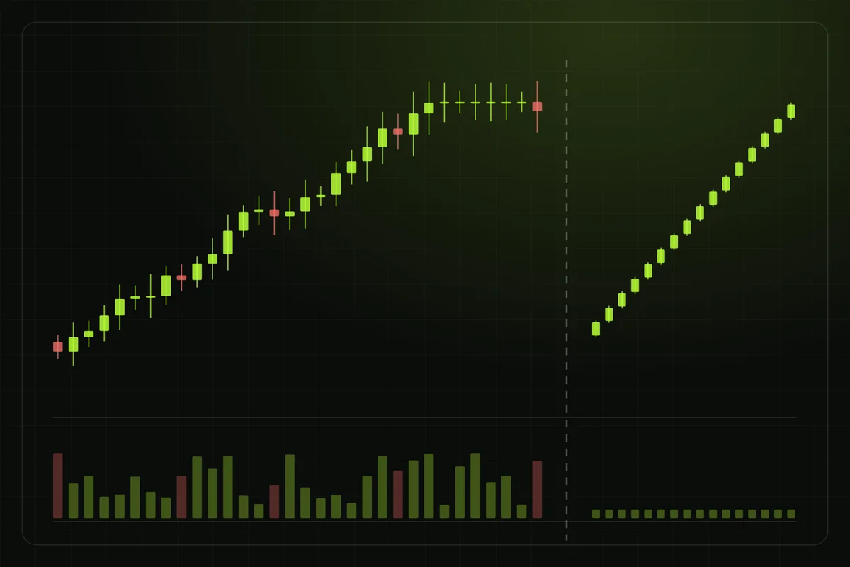
The chart shows how price moved while people traded. It will not tell you everything, but it can quickly show whether the market looks real.
What a candle shows
Each candle covers a fixed period. Green usually means the price closed higher than it opened. Red means it closed lower. The thin lines above and below the body show the highest and lowest traded prices in that period.
Which side has more pressure
When buys dominate, buyers keep pushing into higher prices and the chart moves up. When sells dominate, sellers keep accepting lower prices and the chart moves down. The chart helps you see which side is in control.
Red candles are normal
Even a token in a strong uptrend will have sellers. Some take profit. Some exit at break-even. Others cut a loss or move into another trade. That creates red candles, lower wicks and short pullbacks.
A market with real activity usually looks uneven. It moves, pauses and pulls back.
When a chart looks too clean
A chart that only moves up deserves more checks. The absence of red candles can mean that holders are not selling, but it can also mean that selling is restricted, liquidity is thin or the displayed activity is being manipulated.
What to look for
- Almost every candle is green
- Candles form the same staircase pattern
- Sell volume is missing or unusually low
- Small sell orders fail or return an unexpected amount
Healthy growth is messy. Perfect growth needs a reason.